Adidas Originals — The Originals
(Services)
Art Direction
,
Branding
,
Campaign Rollout
(Industry)
Fashion
(Year)
2025
(Information)
Client: adidas Originals · Year: 2025 · Industry: Fashion
Role: Creative Direction, Art Direction
(The idea)
The Originals puts the brand’s heritage pieces back where they belong: front and center, shot with attitude. Track tops, three stripes and Superstars aren’t treated as nostalgia, but as the reason the brand is iconic in the first place.
(My role)
I led creative development for the campaign: the concept, the look and feel, and the cross-platform rollout. I worked with design and production teams to build the campaign visuals and a rotating title system.
(Hero visual)
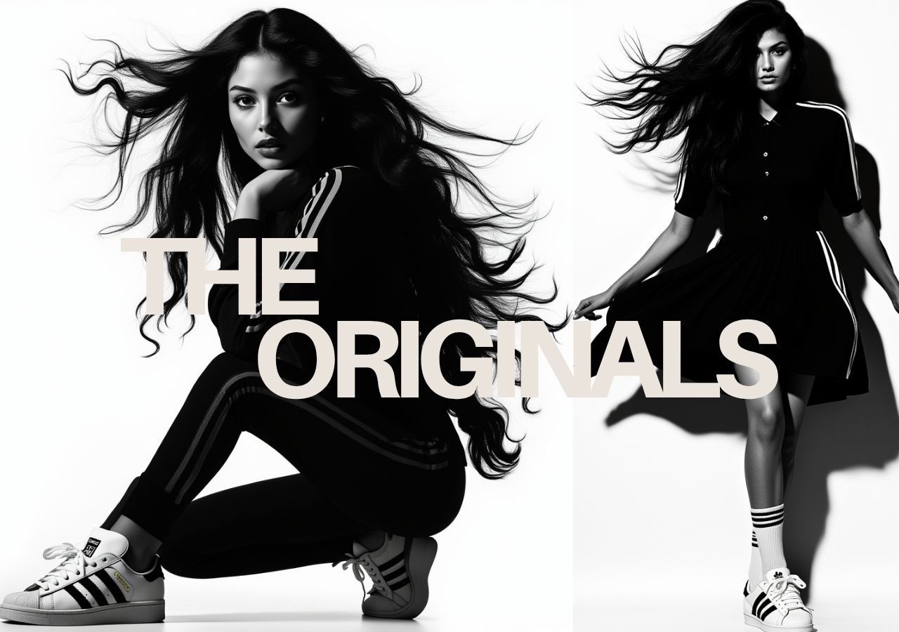
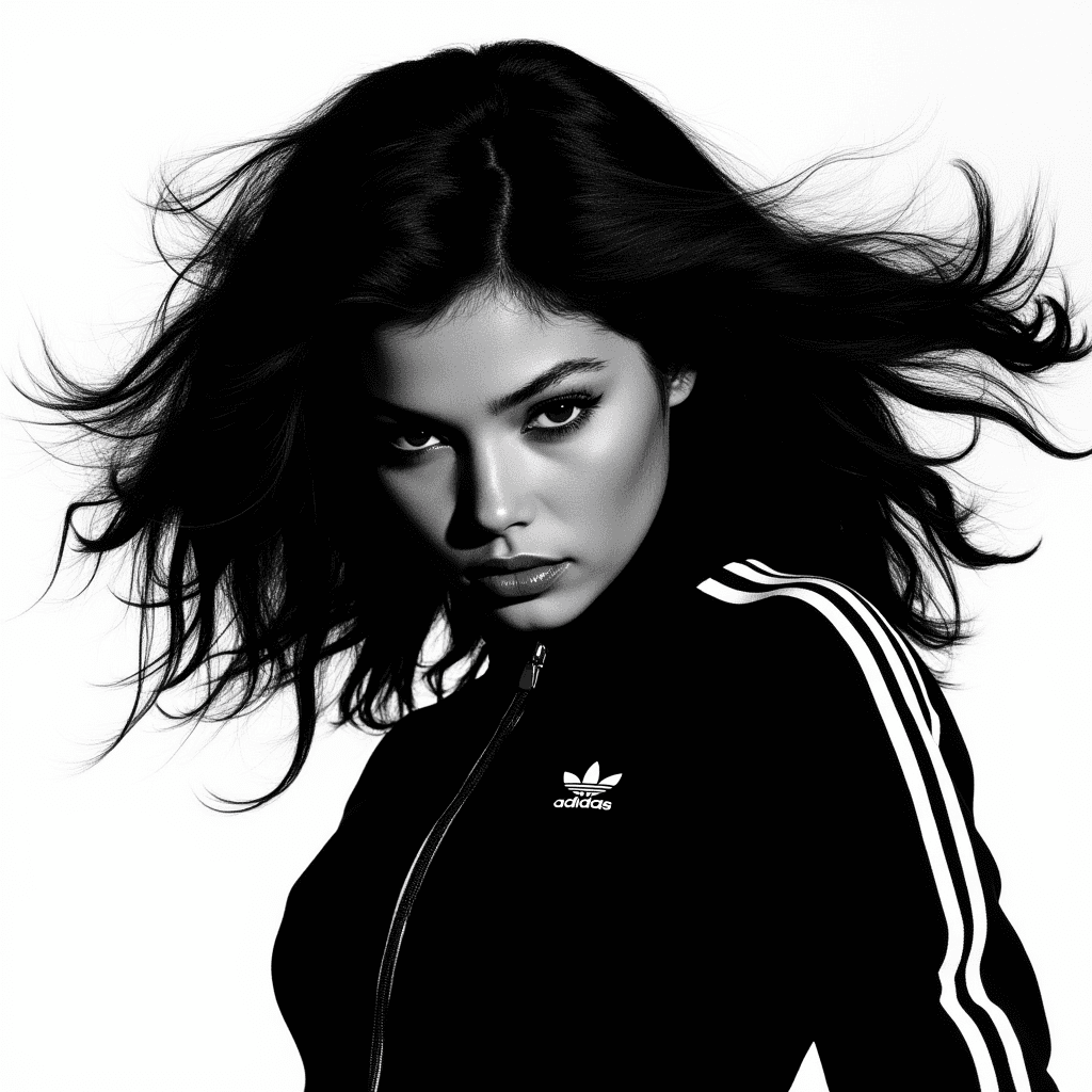
One face, one track top, nothing else. A hard white backdrop and windswept hair turn a simple portrait into a statement. The three stripes on the sleeves become graphic lines that frame the headline.
(The title system)
One layout, rotating titles. The headline always reads “THE” on the first line, with a second word stepped in below it, so the same image can carry a different message:
THE ORIGINALS: the heritage line
THE CLASSICS: the same frame, retitled for Superstars and track pants
THE BOLD.CHIC: the fashion-forward edge
(The color break)
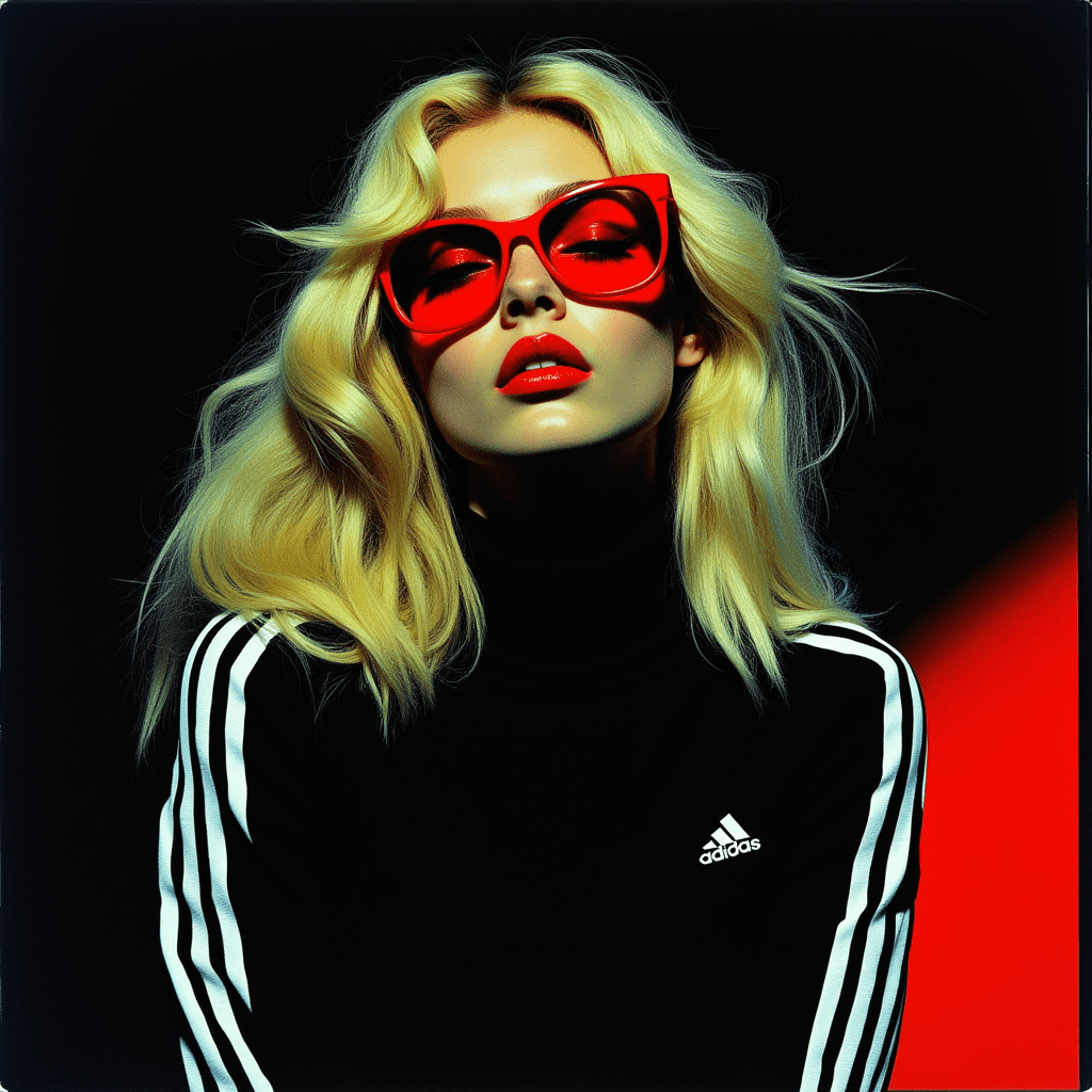
THE BOLD.CHIC breaks the black-and-white world on purpose. Platinum hair, red frames, red lips and a red light leak against black shift the campaign from heritage to high fashion without losing the stripes.
(Visual system)
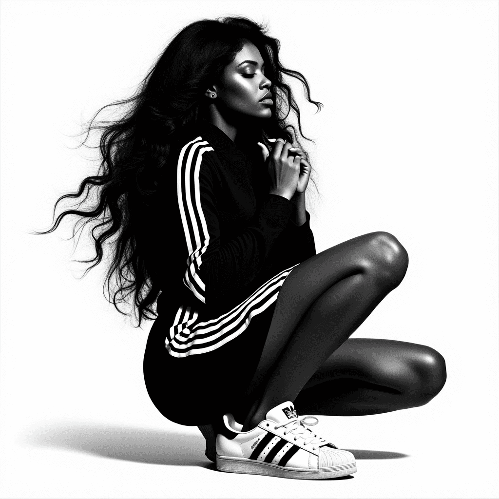
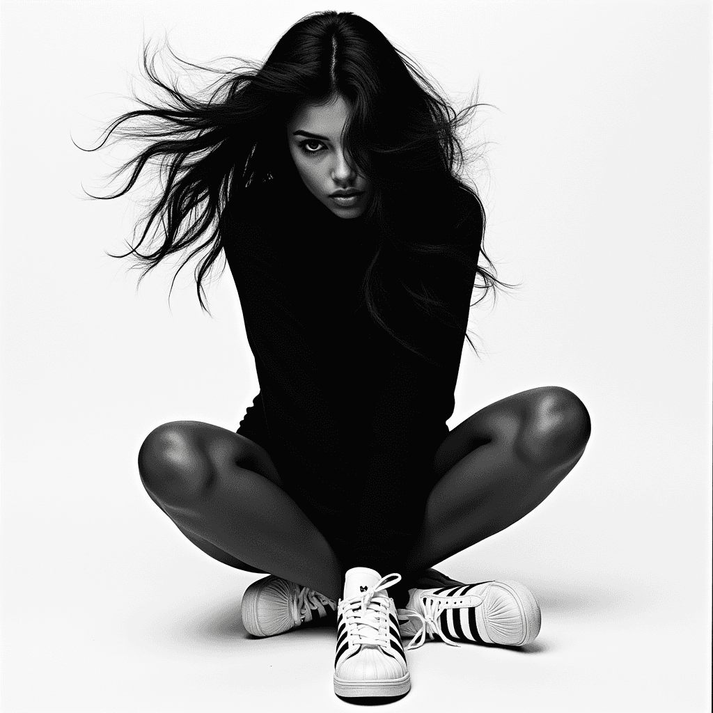
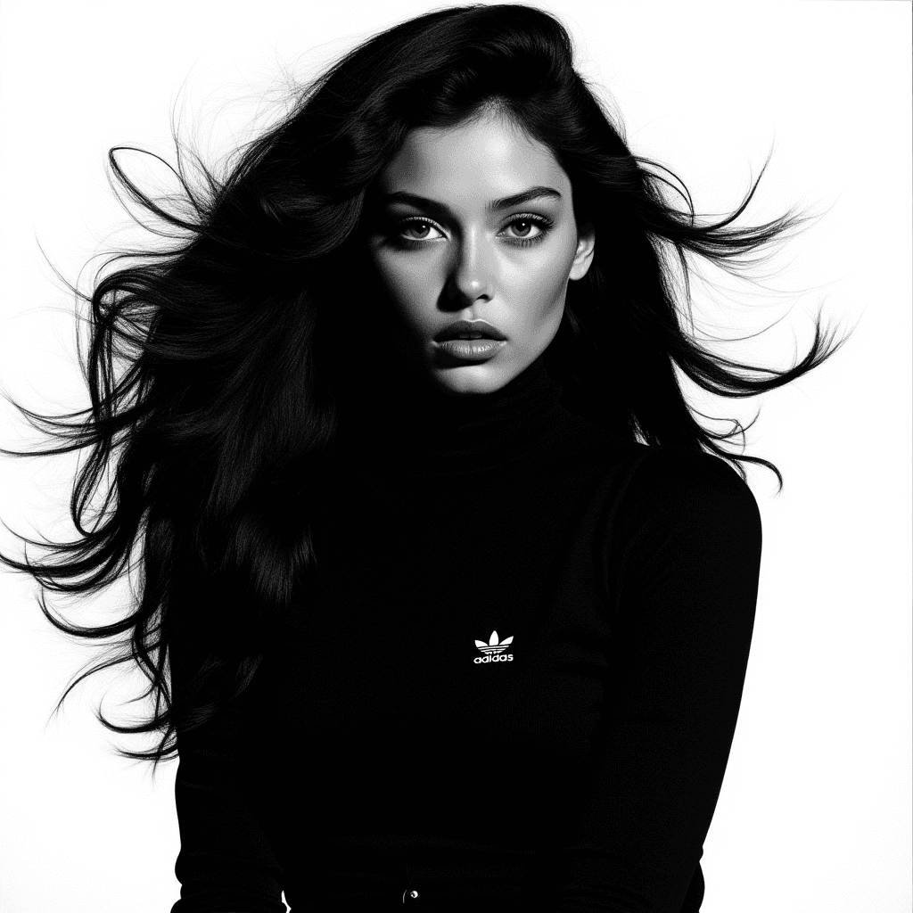
High-contrast black and white, with red used only to break the pattern. Movement comes from the hair, never from the product. Oversized grotesk type in warm off-white sits across the body and overlaps the model. The trefoil or performance logo stays small and on the garment.
“We didn’t reinvent the wheel, we reminded people why it was iconic.”


More Projects
Adidas Originals — The Originals
(Services)
Art Direction
,
Branding
,
Campaign Rollout
(Industry)
Fashion
(Year)
2025
(Information)
Client: adidas Originals · Year: 2025 · Industry: Fashion
Role: Creative Direction, Art Direction
(The idea)
The Originals puts the brand’s heritage pieces back where they belong: front and center, shot with attitude. Track tops, three stripes and Superstars aren’t treated as nostalgia, but as the reason the brand is iconic in the first place.
(My role)
I led creative development for the campaign: the concept, the look and feel, and the cross-platform rollout. I worked with design and production teams to build the campaign visuals and a rotating title system.
(Hero visual)
One face, one track top, nothing else. A hard white backdrop and windswept hair turn a simple portrait into a statement. The three stripes on the sleeves become graphic lines that frame the headline.
(The title system)
One layout, rotating titles. The headline always reads “THE” on the first line, with a second word stepped in below it, so the same image can carry a different message:
THE ORIGINALS: the heritage line
THE CLASSICS: the same frame, retitled for Superstars and track pants
THE BOLD.CHIC: the fashion-forward edge
(The color break)
THE BOLD.CHIC breaks the black-and-white world on purpose. Platinum hair, red frames, red lips and a red light leak against black shift the campaign from heritage to high fashion without losing the stripes.
(Visual system)
High-contrast black and white, with red used only to break the pattern. Movement comes from the hair, never from the product. Oversized grotesk type in warm off-white sits across the body and overlaps the model. The trefoil or performance logo stays small and on the garment.
“We didn’t reinvent the wheel, we reminded people why it was iconic.”